With Android 12, Google has introduced a new graphical approach to its operating system. The Material You constitutes the biggest visual turning point of the green robot since the introduction of Material Design, and develops in continuity with respect to this while upsetting its principles. If before functionality was in first place, now that users have become familiar with smartphones and their language, it is possible to change direction, favoring experience, the emotional dimension and personalization.
And obviously all the apps in the large Google suite are also affected by this revolution, including Telephone, which over the years has gone from being a simple and sparse solution to one of the most advanced available. Mountain View had already updated the look to the new dictates of Material You, making it sensitive to the unprecedented chromatic management of dynamic themes, that is, those generated from the background chosen by the user for their device.
THE NEW LOOK
But that’s not all, apparently: as reported by some users, big G would indeed have begun to test (for now in limited form) a new design for the dialer – the Phone app number pad. In the comparison between the two images you find below you can appreciate the differences between the current version (on the left) and the unedited one that is being tested.
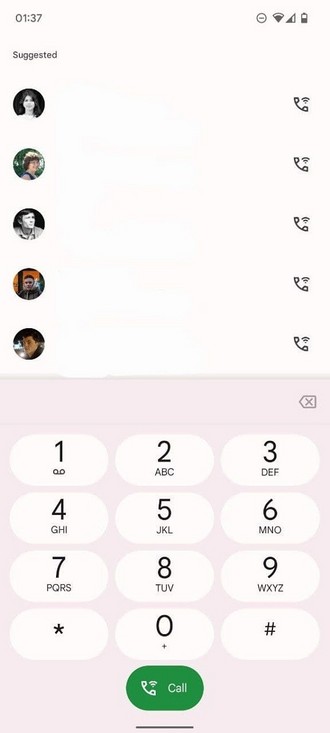
The changes are evident: now the numbers are isolated inside “pills” that recall the physical keypads and create a chromatic contrasting game with the background. AND what changes is also the animation that accompanies the pressing of the keyswith a visual effect that “lights up” the key and expands outwards starting from the point of contact between the finger and the display.
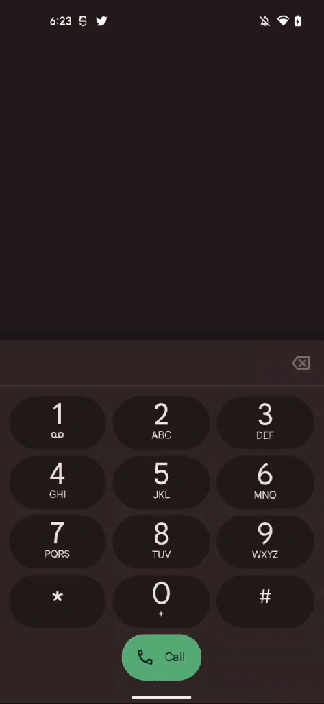
Below, however, you will find some examples of different color configurations with the light system theme and the respective versions with the dark one.