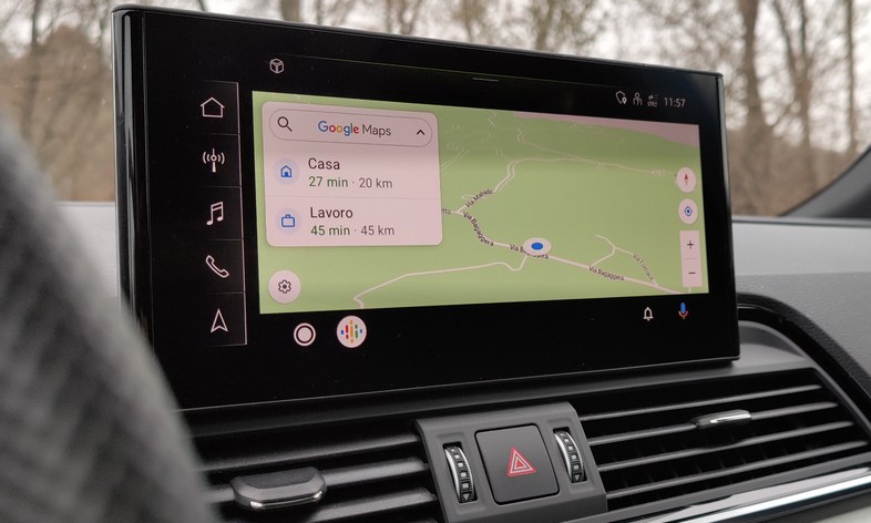
Alongside the numerous innovations announced in September for Android Auto, Google is quietly carrying out a redesign of the user interface. We have been working on it for months in the corridors of Mountain View, and the feeling is that it can debut from one week to the next. In the meantime, however, we have the opportunity to find out some of the changes to the interface and its layout that Google has in store for users of the green robot who use Android Auto.
The philosophy on which the renovation will be focused is to avoid that an action to be performed while being guided by Maps can make the route and directions disappear from the display of the car. In addition to splitting the screen into two halves which on the one hand displays information other than navigation as you can see from the image below, in the meantime some changes will arrive to purify the interface from information that can distract you.
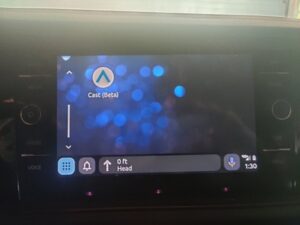
The status bar will disappear with the information contained within it (network signal, Wi-Fi, remaining autonomy, and clock) transferred to the lower right corner, and also the button to divide the interface into two parts: the action can be performed with a long press of the button home. It seems that an app will debut, in the image still in beta version, called Cast, which intuitively should allow you to duplicate the smartphone screen on that of the car using Google Cast.
Whenever possible, then, one of the halves of the screen will be destined for a widget in which Google Assistant will show some relevant information to travel, such as the weather forecast. Furthermore, to offer maximum concentration on navigation the driver, while consulting Maps and the need to perform a different operation takes over, this will be managed through the half of the screen closest to the driver’s seat, leaving the map in the other half of Google Maps.


