Whatsapp is unleashed in recent times, given that between the stable version, beta channel, and detector code there are so many innovations introduced or about to be released by the platform. Only in the last few days, we have covered the topics of voice messages, camera, administrative functions, and end-to-end encryption, and now let’s see what is about to happen instead. in the application interface.
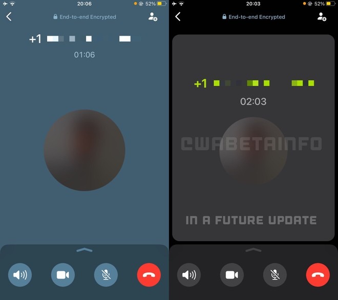
The reference goes in particular to the UI for voice calls, already the subject of changes last summer with a refresh to the aesthetics and the possibility of joining a group call that has already begun. And now WhatsApp seems to have plans to further renew the graphics of the screen, making some small but significant changes.
WABetaInfo as always allows us to observe in detail what changes – will change, it is more correct to say, since the news is still hidden in the code and will be released on the first Android and iOS betas only in the future. In the images above you can see the current interface (left) and the – potential – new one (right). The result is a revamp aimed at making the voice call screen clearer, without frills, in general, more in keeping with current aesthetic standards.
The example shows the UI on WhatsApp for iOS, but the same innovations are also being developed for Android. As always, it is impossible to predict the release times, but we assume that something can already move starting from one of the next betas.


