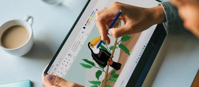
The years go by, the versions of Windows follow each other, but Paint stays. And with Windows 11 Microsoft has decided to intervene to modernize the appearance of the app and align it with the rest of the UI. A general problem that traditionally plagues new iterations of the Redmond operating system, however, is the consistency of the various elements of the interface, with the surface changing its appearance and some windows and actions that instead remain tied to the past. And not even the new Paint escapes this rule.
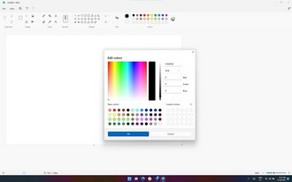
However, with the update just released for the app for Insiders subscribed to the Dev channel, there are many adjustments that make everything more uniform, with dialog boxes that now speak the same visual language as the rest of Paint and Windows 11. In the screens below you can appreciate how both the window dedicated to the choice of colors and that of the “resize” and “rotate” functions have been modernized.
But that’s not all, because, in addition to the coat of paint on the aesthetics of the app, Microsoft has also intervened on a functional level introducing the possibility to change the secondary color simply by holding down the Shift key and clicking on the desired hue within the color palette. In addition, some issues that caused text to shift when writing and lack of localization for some languages, such as Hebrew, have also been fixed. Finally, the update also integrates better support for screen readers.
What about dark mode? Still no trace, for the moment: but the hope is that considering the intention to make Paint an integral body and not extraneous to the rest of the system, this function will also arrive over time.


