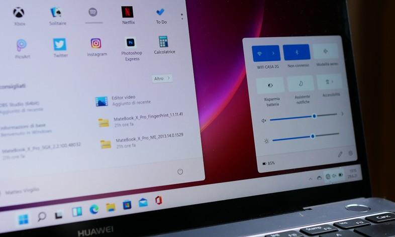
With this week’s Insider build of Windows 11, Microsoft has made some changes to the graphical interface that, if desired, can be defined as small, but equally important in the path towards a modern and current all-round interface: here is the new look for the volume indicator and the multitasking page (ALT-Tab). The graphics update for other indicators besides the volume ones: brightness, airplane mode, and camera toggle.
To clarify, it’s the little popups (or flyouts, as Microsoft calls them) that appear when you press hardware buttons, or keyboard combinations, that modify this parameter. The current style is still based on the Metro design, which debuted in the days of Windows 8. Not only does the Fluent Design flyout look more consistent with Windows 11 in general, but it is also located in another location, bottom center instead of the top left corner, and is oriented horizontally instead of vertically. When the flyout is visible on the screen, you can drag the cursor with the mouse pointer.
Regarding the multitasking interface, for some reason, Microsoft doesn’t even mention it in the changelog. We do not know if it is an oversight or a deliberate omission, perhaps related to some type of A / B test. The fact is that it can be described quite easily like this: instead of full screen, the background blur occurs only around the visual previews of open windows. Another way is the same as Windows 10, only the outline is blurred with the Acrylic effect. Colleagues from Windows Central shot a short video that illustrates it quite effectively.
The changelog of build 22533 includes several other items, but it can be argued that they are not particularly exciting. It is perhaps worth quickly mentioning the new Your Phone window/popup graphic dedicated to ongoing calls, with new icons, fonts, and other elements that better align it with the style of Windows 11.


