Continue our journey into the world of infotainment systems more recent, the technological heart of the latest generation cars and means of transport is in fact one of the increasingly determining factors in the selection phase. Today we focus on the Kia Xceed PHEV, a model that we have already tried in recent months by testing it in a commuter context.
However, we are not here to talk about consumption and performance, let’s leave aside any other considerations in this regard and thus concentrate on the technological substance of the UVO system, on the interface and functions supplied with this model. There are, of course, many similarities with Hyundai’s Bluelink system that we told about Kona Electric in the first episode of this column.
INDEX
INTUITIVENESS
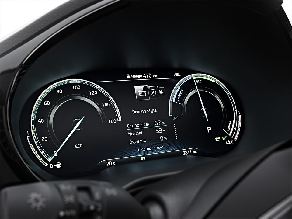
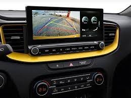
Instrumentation full digital, the essential part for the driver can be clearly seen on a 12.3-inch display and everything else can be found on the 10.25-inch central display, many functions that we will gradually talk about in this article. The Xceed PHEV is a Plug-in Hybrid as the name itself makes clear, this means an abundance of information for both propulsion systems that blend well within the instrument cluster.
This last step is certainly not taken for granted, Kia has basically divided the display into three, leaving the odometer and the residual autonomy relating to the heat engine on the left; in the middle the different information on destination, speed, calls, ADAS, and more, on the right everything related to the electrical part. Therefore power is required from the engine and regeneration under braking, in addition of course to the remaining range. We found the distribution tidy and clear information to read, the buttons on the steering wheel for controlling the radio stations, navigation within the interface, cruise control, and much more were also ordered and well-positioned.
On the central display, things change slightly, so many categories available and multiple options and functions: the UVO system is large and complex, on his side, it boasts a certain speed of execution in the passages, and on the other hand graphics that are not yet among the most modern. The environment is very similar to that seen on Kona, as already mentioned, which is why there are still doubts about the optimization of categories and the ability to reach any function in a few clicks. You have to get comfortable, use it a lot and find all the necessary functions.
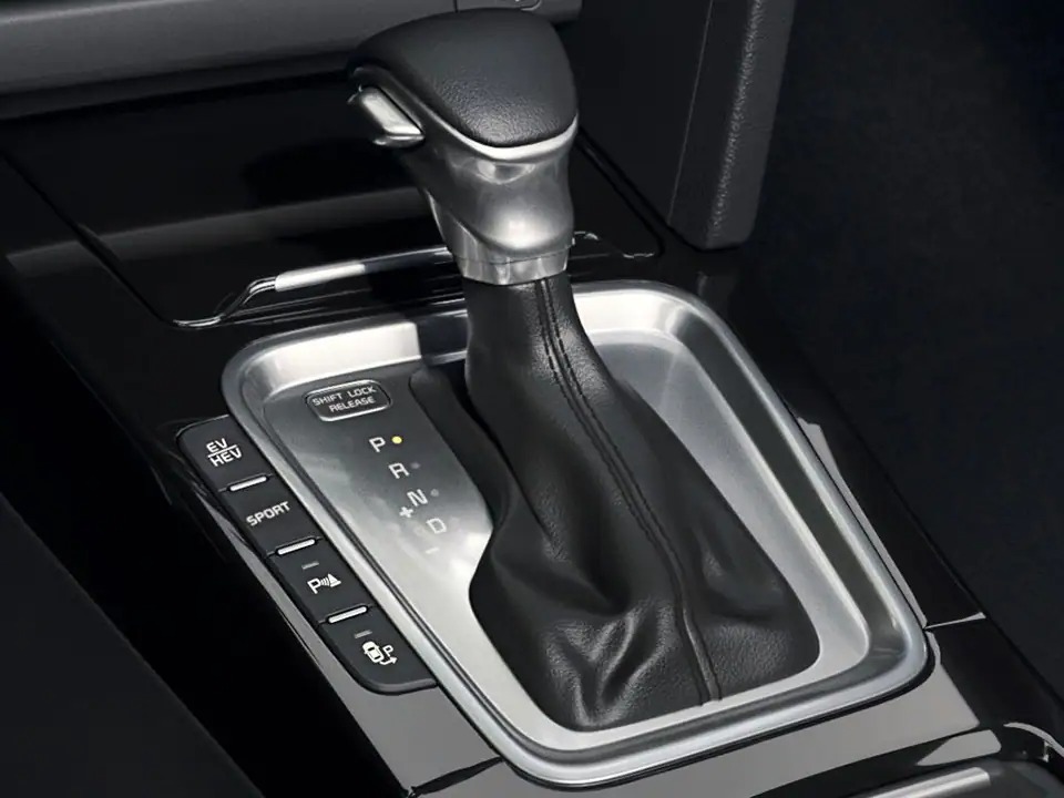
The physical button at the bottom, near the gearbox, is very useful, which allows you to switch from “thermal only” to “hybrid” or “electric-only” mode without misunderstanding, as long as you have enough charge (remember that the electric autonomy is about 50 km).
NAVIGATOR AND VOICE RECOGNITION
Among the advantages of Kia, the navigator connected fast in the answers and Live Services powered by TomTom which automatically provides information on charging stations, speed cameras, weather, traffic, parking, and much more. Really quick to provide a destination on the screen once the request is entered, even if you set a point hundreds of kilometers away.
Some difficulties were encountered instead in voice recognition, especially with some background noise. In our test, it was in fact the rain that created that (slight) disturbance that did not allow us to steal the commands and perform the required actions. As told in the video, the noise was not that strong, therefore it remains an obvious limit via third-party apps on Android Auto and Apple Carplay.
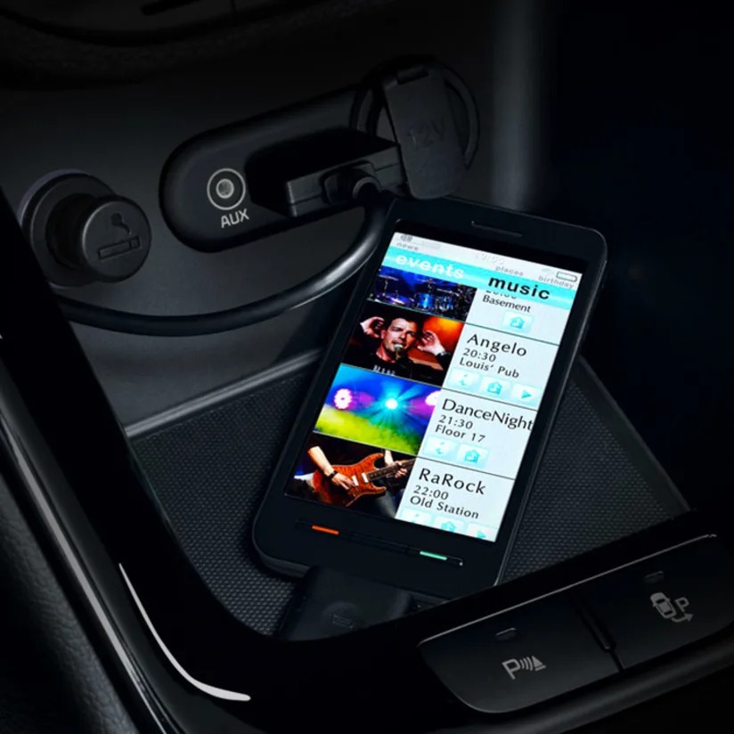
On the other hand, pairing via the Bluetooth voice request is easy and immediate, plus you can associate two mobile devices at the same time.
ANDROID AUTO / APPLE CAR PLAY
Let’s start from the Google environment, therefore Android Auto is very fluid and fast after the connection via cable is made, with all the applications that respond without jamming. Navigating is a pleasure and you can switch from one to the other very quickly. As already mentioned in the previous chapter, there is also voice recognition that raises the level of understanding compared to the native system.
Pairing on the iPhone is also very fast, Apple Carplay is therefore immediately available and, as usual, guarantees an extremely pleasant browsing experience. In comparison with Android Auto, it is always and in any case more reactive and even in this situation, we have confirmation.
The level reached by these two software environments is now very high, moreover, the usability of the interfaces studied by Apple and Google reflects very well what should be the type of experience that is expected from a (new) car in 2021. They both represent a nice added value, only the most reliable voice recognition proves it.
UVO CONNECT APPLICATION
To truly enter into symbiosis with your (connected) car, you must necessarily go through the proprietary UVO Connect application, which is certainly not very easy to connect the first time due to all the safety steps. Allow at least ten minutes to complete the connection successfully.
Being a connected car, there is all the information on the state of the vehicle, therefore geolocation, residual autonomy, state of the recharge (for the electrical part), and much more, including the internal temperature. From a distance it is in fact possible to air-condition the vehicle and bring it in the desired conditions, arriving by car with a nice warmth waiting for us in this period is in fact convenient.
Quick and well-done application, even graphically, you navigate with ease from the first moment and everything seems to be positioned in the right place.
WHAT WE LIKE AND WHAT WE DON’T
Two souls and one car, naturally those who choose a Plug-in hybrid want exactly this and the management of the two environments must rise to the occasion. Both from a graphic and practical point of view it is like this, at least on Xceed PHEV, with the information well separated on the instrument panel and the dedicated physical button that allows you to switch from one to the other modes in a flash, in maximum clarity. For those who want the best, moreover, Kia has provided just below a “Sport” button that provides all the power available to the vehicle.
We also appreciated the rapid response of the infotainment system in general, as you can see from the video, all the commands respond immediately to requests, the touch is precise and the only real indecision was revealed in the voice recognition. The graphics can be improved as usual, as mentioned for Hyundai Kona also for this Kia Xceed PEHV (and for all the models of the Korean house that use this infotainment system) a refresh would be desirable, as well as a reorganization that can reduce the number of items in the center display.
